The idea
01
Breakfast with
a little less pressure.
COOL DOWN links the freezer aisle with the cool-down after exercise. The name suggests easing off, which led to “Keep your cool. Toast your waffles.”
We led with the waffle and its toppings, then gave the protein callout a clear place beside them. Breakfast should look good before you read the benefits.
The identity
02
Big, soft letters.
The big, rounded letters give COOL DOWN a relaxed feel. Blue and yellow make the name hard to miss.
We kept “Protein Waffles” in white so the product is easy to read beneath the name.
Soft shapes. A bold blue and yellow base.
The packaging
03
A breakfast you can picture.
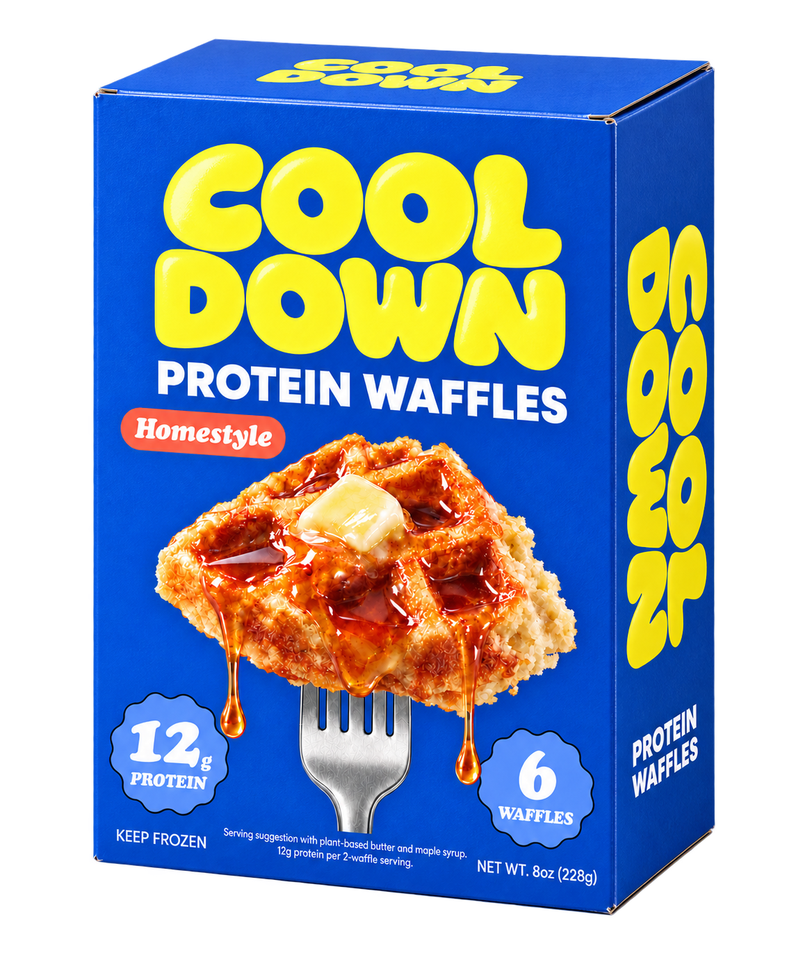
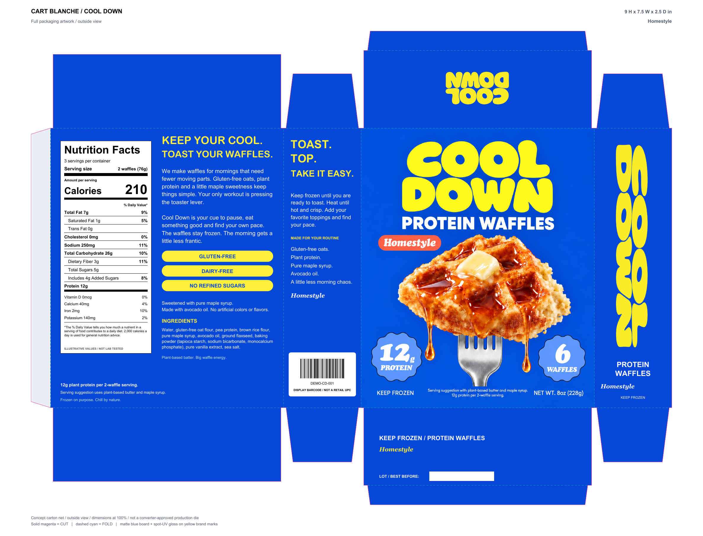
A waffle on a fork, with syrup dripping from it, makes breakfast easy to picture. The name, flavor, protein, and pack count stay easy to find around it.
The name repeats on the top and side. The back holds the brand story and product details, and the folding view shows how it all fits on the carton.
Scroll to see the carton fold into shape.The range
04
Three ways to start breakfast.
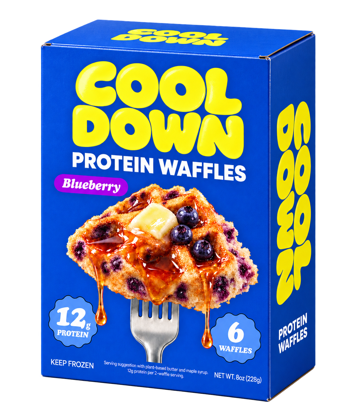
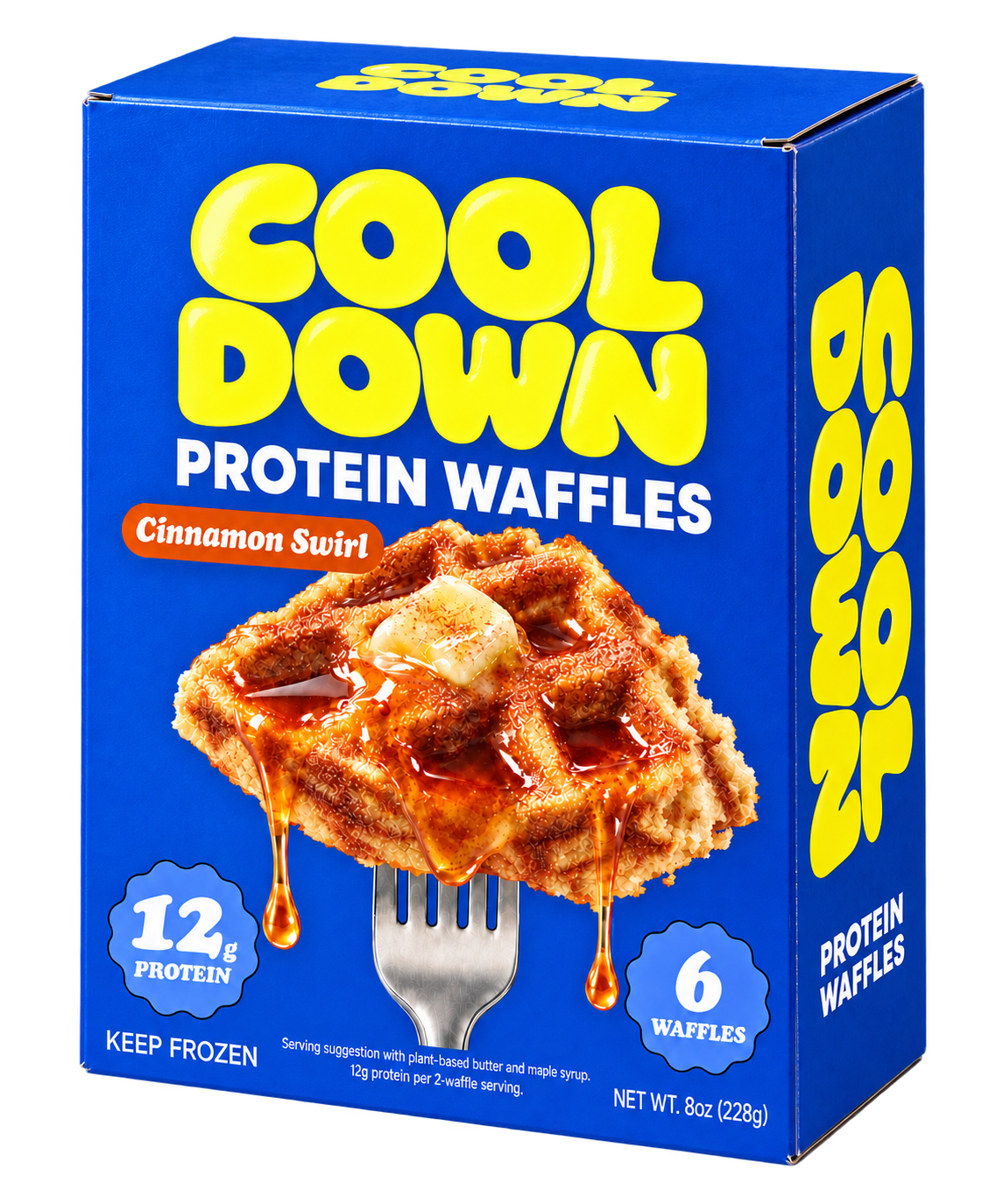
The blue box and yellow name stay the same. Coral marks Homestyle, purple marks Blueberry, and orange marks Cinnamon Swirl.
The waffle images change too, so the flavor is shown as well as named.
The freezer
05
Through the freezer glass.
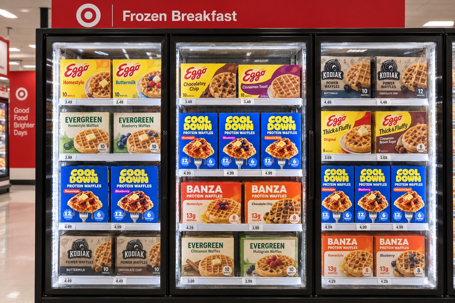
Blue and yellow connect the cartons in the freezer. The flavor labels and waffle images help separate them.
Can you read the product and find your flavor through the glass? The freezer mockup gives us a way to check.
Illustrative freezer mockup.