The idea
01
A pantry staple.
A fresh squeeze.
We started with a squeeze bottle, then built a soy sauce brand that would feel at home in an everyday kitchen.
The drop character links “One drop. Big flavor.” to the way the bottle works. It gives the brand a friendly face with a reason to be there.
The identity
02
A name with a drop of meaning.
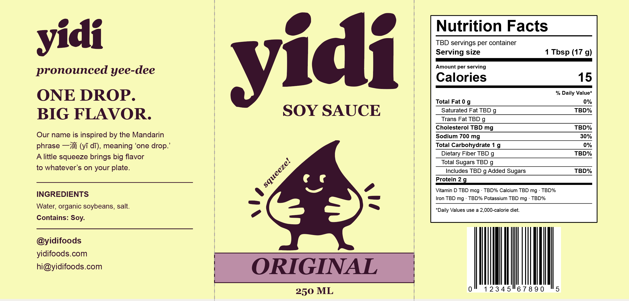
YIDI (say “yee-dee”) takes its name from 一滴, Mandarin for “one drop.” That gave us the smiling drop character and the line “One drop. Big flavor.”
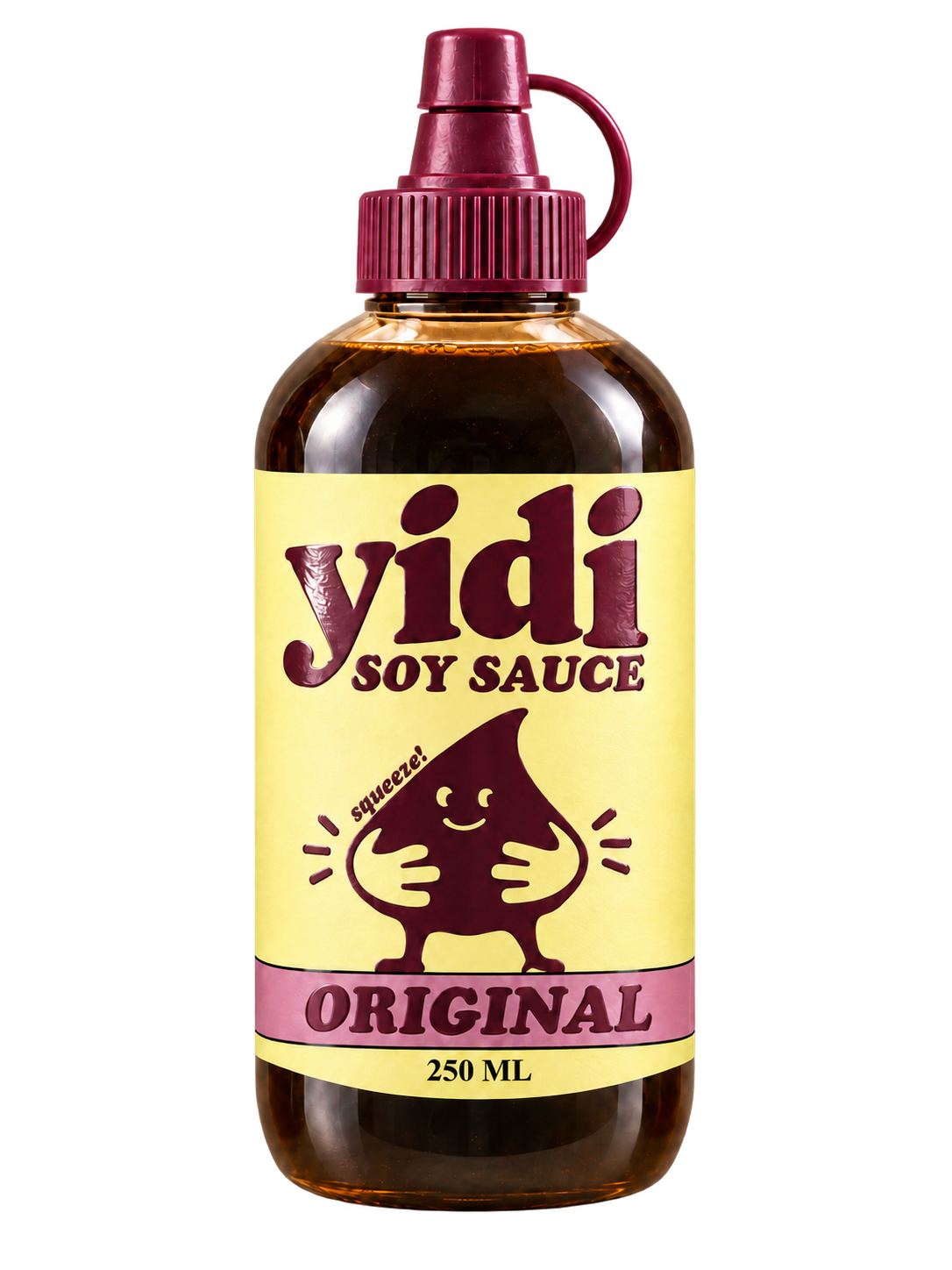
Broad curves keep the lettering friendly. Yellow brightens the label, while plum ties the logo, drop character, and cap together.
A yellow label with a plum cap and logo.
The bottle
03
The bottle is
part of the brand.
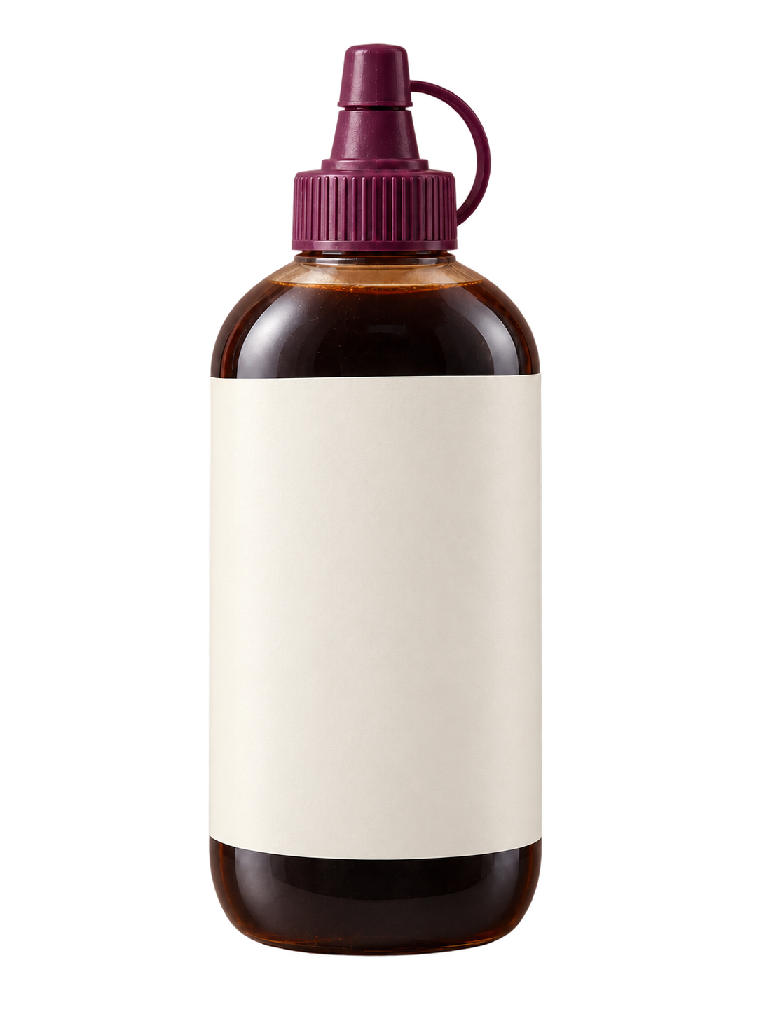
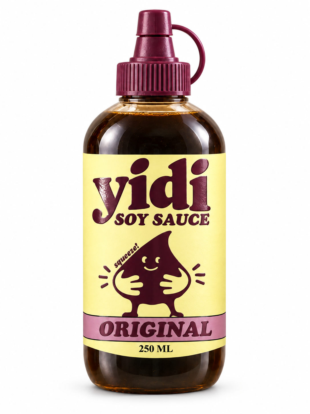
The rounded bottle and narrow cap make the squeeze format visible before you read the label.
A clear bottle lets you see the sauce. The plum cap repeats the label color, so the bottle and branding feel like they belong together.
The packaging
04
Keep the important bits at the front.
The name and “Soy Sauce” tell you what you’re holding. The character adds a little personality, and the colored band identifies the flavor. The longer copy sits around the sides.
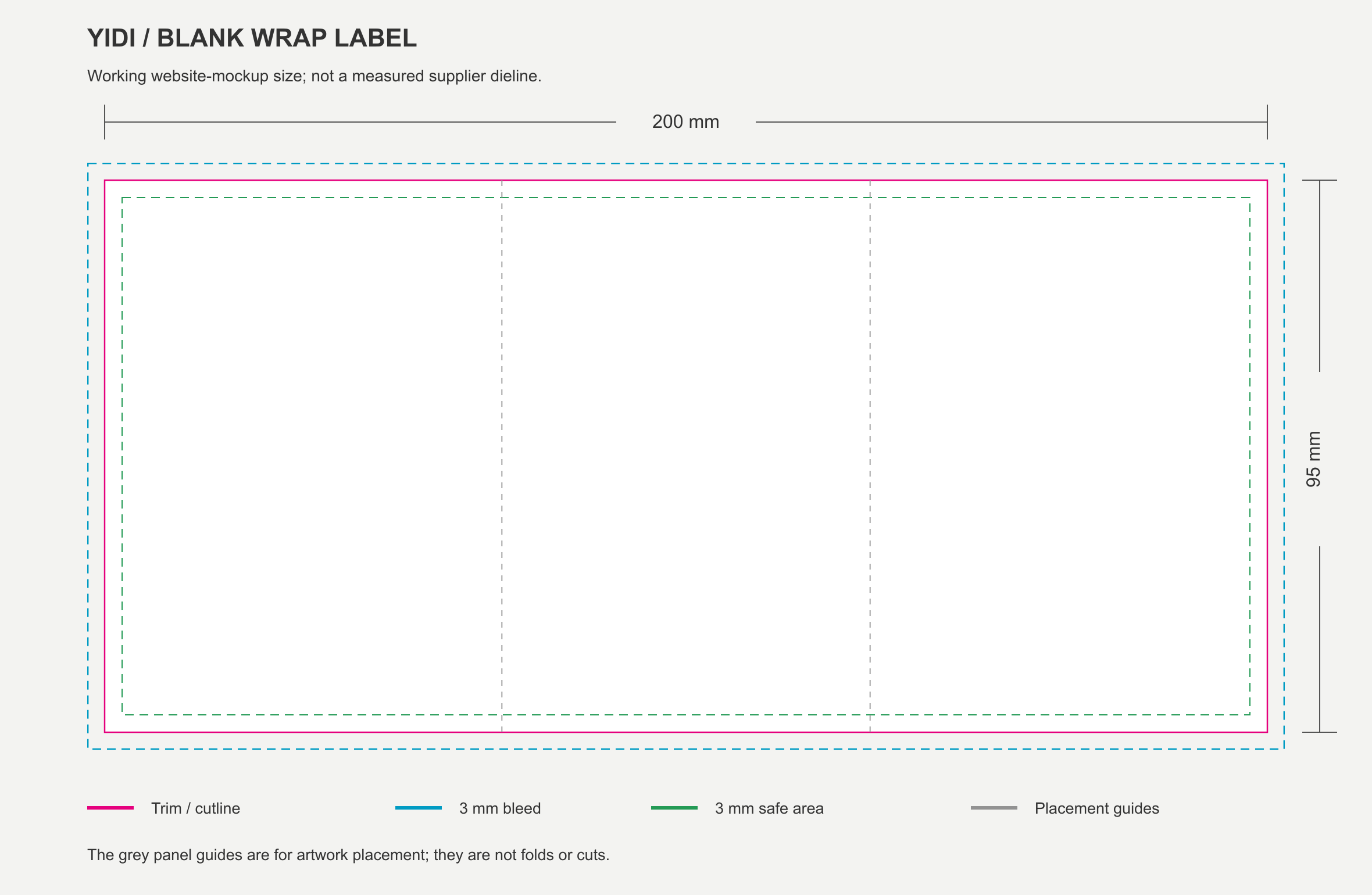
On a curved bottle, the name, product, and flavor need to stay in view together. The wrap shows how we placed them.
Scroll to see the label wrap around the bottle.
The range
05
Original, Sweet, or Heat?
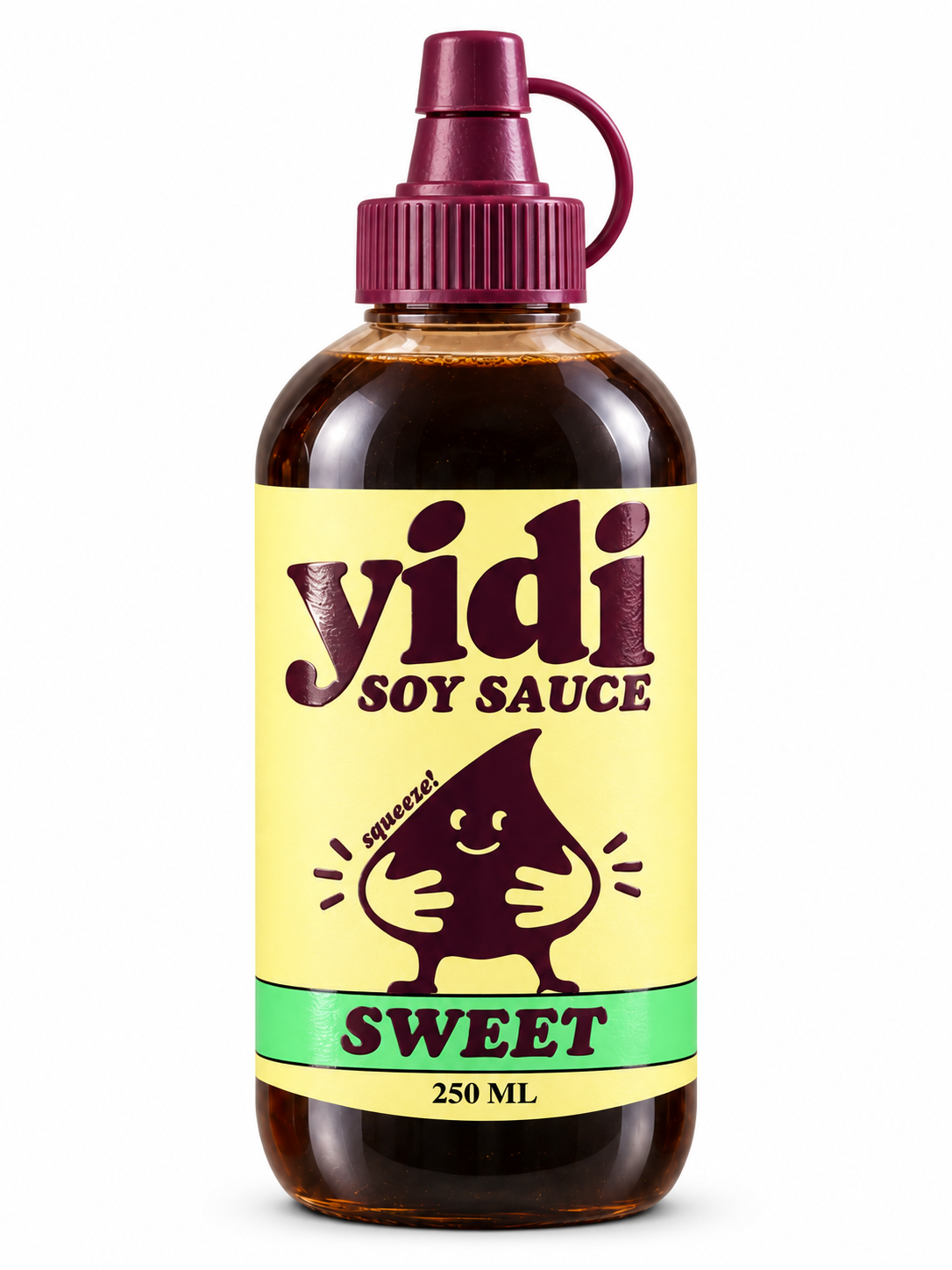
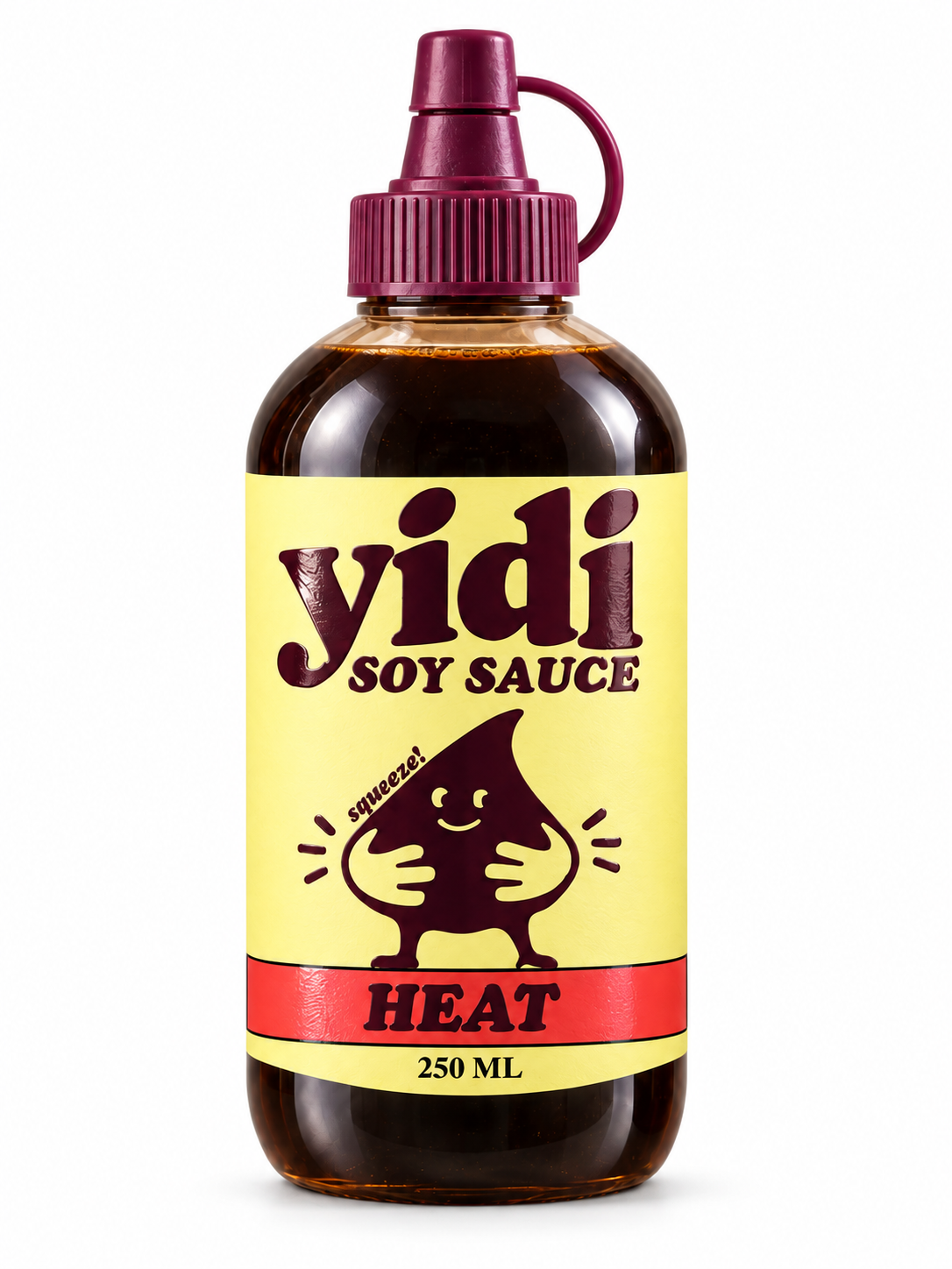
Pink for Original, green for Sweet, red for Heat. The bottle, cap, and yellow label stay the same.
The shelf
06
Easy to spot together.
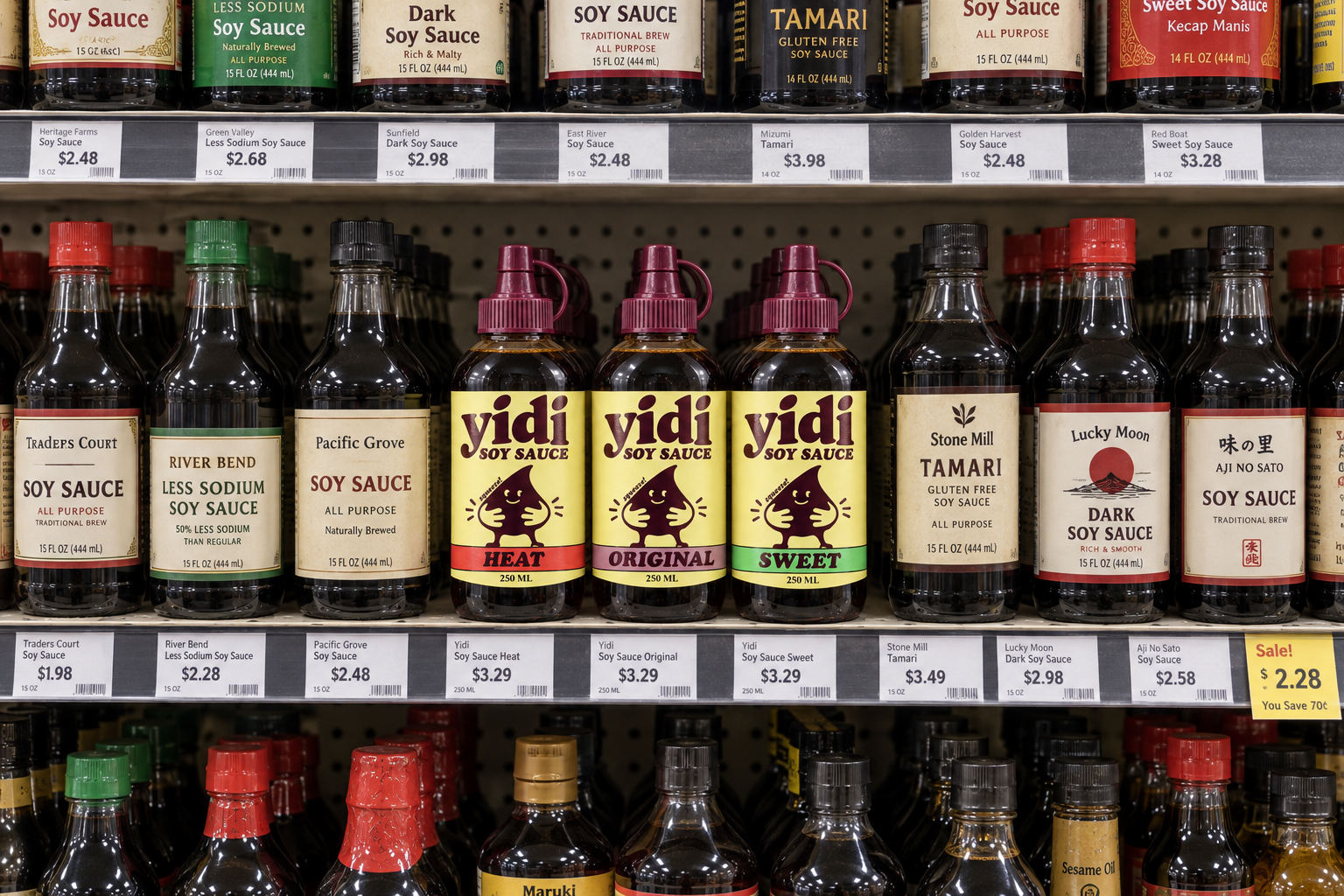
Yellow labels and plum caps repeat across the shelf. The colored bands give each flavor a clear place in that group.
From a few steps back, can you spot YIDI and tell the flavors apart? That’s what this mockup helps us check.
Illustrative shelf mockup.