A founder’s case study
From 5 stores
to 530.
Good Word is my own snack business. I built the brand and packaging, found the suppliers, and worked through the production details that got it onto Whole Foods shelves.
I’m Brad. This is where a lot of the experience behind Cart Blanche comes from.
Start with the shelf ↓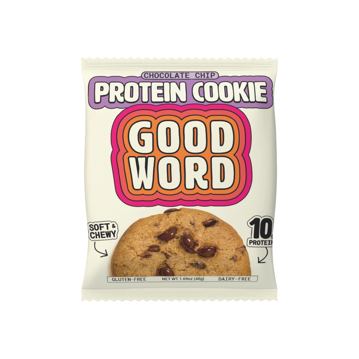
Whole Foods stores at launch
2019
Whole Foods stores
2026
Founder, designer,
and the person on the supplier calls.
Brand strategy · Naming · Identity · Packaging · Supplier sourcing · Manufacturing coordination · Case configuration
01 / Finding the opportunity
It started with
a gap on the shelf.
When I first looked at protein cookies in Whole Foods, there were three brands on the shelf. I saw room for something that better matched what I felt that shopper wanted, in both ingredients and packaging.
The starting point was a cookie made with clean ingredients and a brand that felt different from the options around it. The product and the packaging had to make sense together.
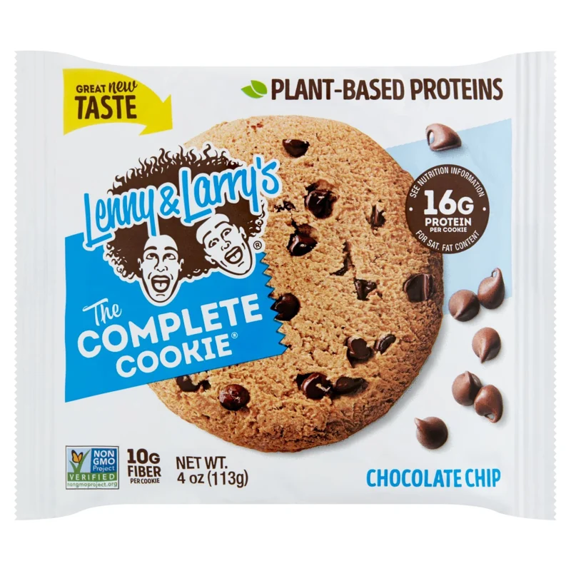
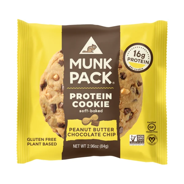
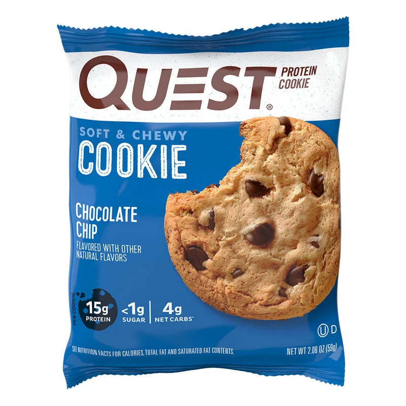
Protein cookie category references.
02 / Building the identity
A little retro.
A little space age.
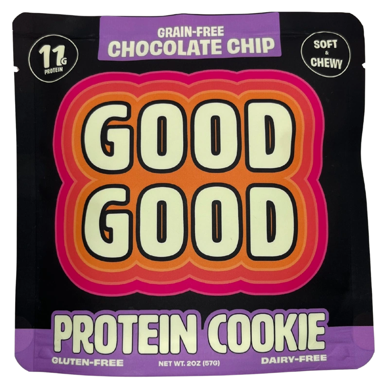
I wanted the pack to have a personality of its own. Big, rounded letters and layers of orange and pink gave it a retro-futuristic feel, with a dark background that made the colors stand out.
The message had a simple order: the brand, the cookie, the flavor. Key product details were there, but I didn’t want a wall of claims competing for attention.
Someone shopping for a snack shouldn’t need to study the wrapper.
03 / A change of name
Two letters changed.
The personality stayed.
The original name, back in 2019, was Good Good. Then came a trademark dispute. Fighting it was more expensive than I could justify, so it was back to the drawing board.
People were already responding to the branding and packaging. I wanted to keep that familiarity. Changing Good Good to Good Word took just two letters, so the design could stay.
A new name didn’t have to mean losing everything that was working.
04 / Listening to customers
Show them
the cookie.
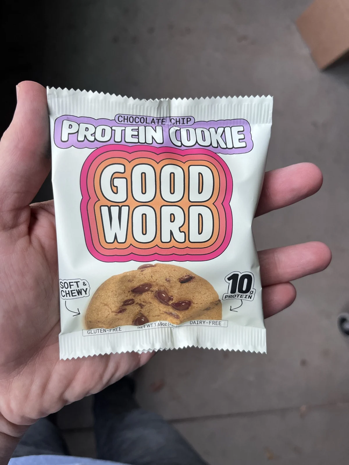
The branding was getting a response, but customer feedback helped me see where the pack could be clearer. People needed to understand what was inside, quickly, at the shelf.
I added a photograph of the cookie and moved to a vintage cream background so the product stood out more. The familiar lettering and bright colors stayed.
The aim was simple: keep the character people liked and make the cookie easier to recognize. Less work for the person choosing it.
05 / One product family
Different snacks.
Same Good Word.
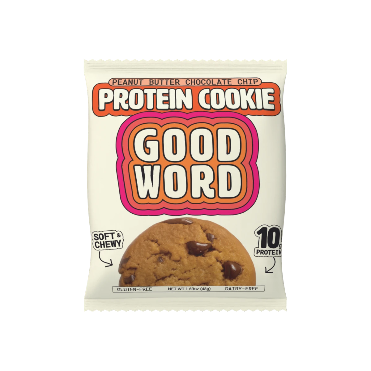
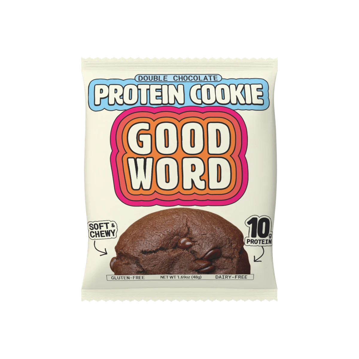
I kept the cream pack and orange-and-pink wordmark consistent across the cookies and squares. The range should feel like Good Word before you’ve read the flavor.
Product names and photography tell you what’s inside. Color helps separate the flavors. Familiar enough to recognize, clear enough to choose.
Protein cookies
Protein squares
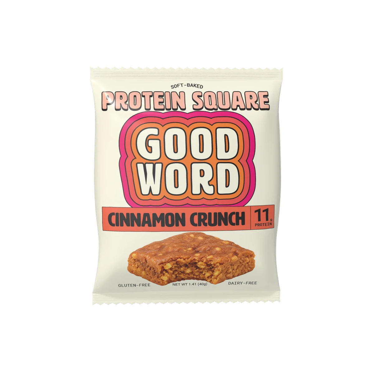
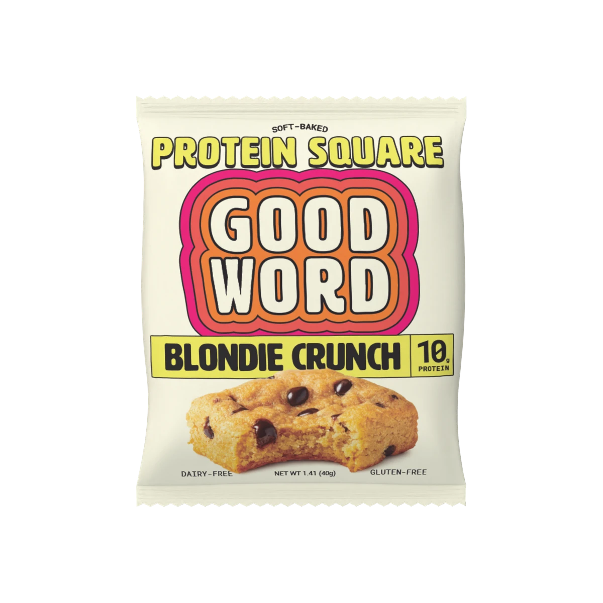
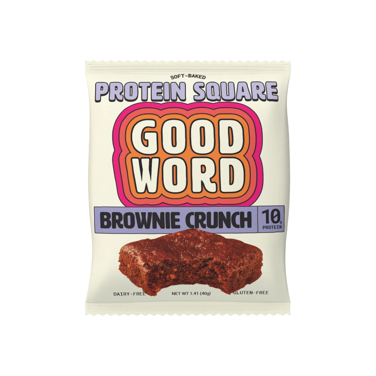
What stays familiar.
The cream background, bold wordmark, warm colors, and illustrated lettering connect the whole range.
What helps you choose.
The cookie or square, the flavor name, its color, and the product photo do the explaining.
06 / Choosing the finish
The feel was
part of the brief.
I was particular about what happened when someone picked it up. The packaging needed to feel as carefully considered as the product inside.
That meant finding suppliers who could deliver a soft-touch matte finish on both the wrapper film and the cartons. The finish was chosen to convey quality through touch as well as appearance.
In the customer’s hand.
A soft matte surface gives the pack a different feel from a glossy wrapper. It was a deliberate part of the premium impression I wanted the brand to make.
In the supplier’s hands.
A finish only matters if someone can produce it. Supplier sourcing was part of the design process, so the material and the intended feel could carry through to the actual packaging.
07 / Beyond the artwork
A pack has to
work in the real world.
I handled the details between the design and the shelf, too: finding packaging suppliers, checking compatibility with the contract manufacturer’s equipment, and working out how everything packed and shipped.
These decisions affect what a business can make, how it gets delivered, and what it costs. They belong in the conversation from the start.
- Find the right suppliers.
- I sourced film and cartons with the look and soft matte feel I wanted, then worked with suppliers to turn that direction into packaging they could produce.
- Make it work on the line.
- I checked the packaging against the contract manufacturer’s equipment. The artwork, material, and format had to work together in production.
- Think inside the bigger box.
- I worked out how the cartons fit into master cases. Their dimensions and arrangement mattered for shipping costs and the way distributors would handle them.
- Follow it through.
- I followed the design through from the individual wrapper to the carton and the case it traveled in, keeping the look and feel connected to the practical decisions.
Less glamorous than choosing a color. Just as much a part of the job.
08 / Growing the business
Start local.
Keep learning.
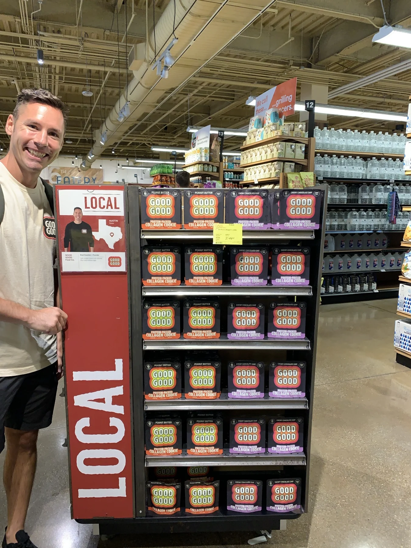
I launched in 5 Whole Foods stores in 2019. By 2026, Good Word had grown to 530 Whole Foods stores.
The brand evolved along the way. Customer feedback shaped the front of the pack. Suppliers and manufacturing shaped how it was made. Growing distribution made the details of cases and shipping matter more.
Building the business meant working through all of it, then carrying what I learned into the next decision.
Visit Good Word ↗Sprouts / 2024
520 stores.
A chance to learn.
Good Word took part in a three-month innovation trial across 520 Sprouts stores in 2024.
H-E-B / Coming next
230 stores.
The next chapter.
We’re preparing to launch in 230 H-E-B stores. The next step in a business I’m still building.
What I bring to your business
I’ve been on
your side of this.
I know what it’s like to make a design decision with your own money, product, and reputation behind it. And to find out that the box you love also needs to fit inside another box.
Good Word taught me to think about the whole experience: what gets someone’s attention, what helps them understand, how the product feels in their hand, and what it takes to get it there.
That’s the perspective I bring to Cart Blanche. Whether you sell a product or a service, I want the design to work for your customers and your business.
Let’s work through yours.
Have a product to launch or a business that’s outgrown its branding? Tell me where you are and what needs to change.