The idea
01A treat first.
A treat first.
Fiber included.
A crispy marshmallow treat is familiar. Added fiber gives it another reason to be picked up, but it still needs to look like something you want to eat.
MALLOW / Studio concept
MALLOW is a high-fiber crispy treat concept. We created the name, identity, cartons, and individual wrappers, keeping the treat first and the fiber easy to find.
See the thinking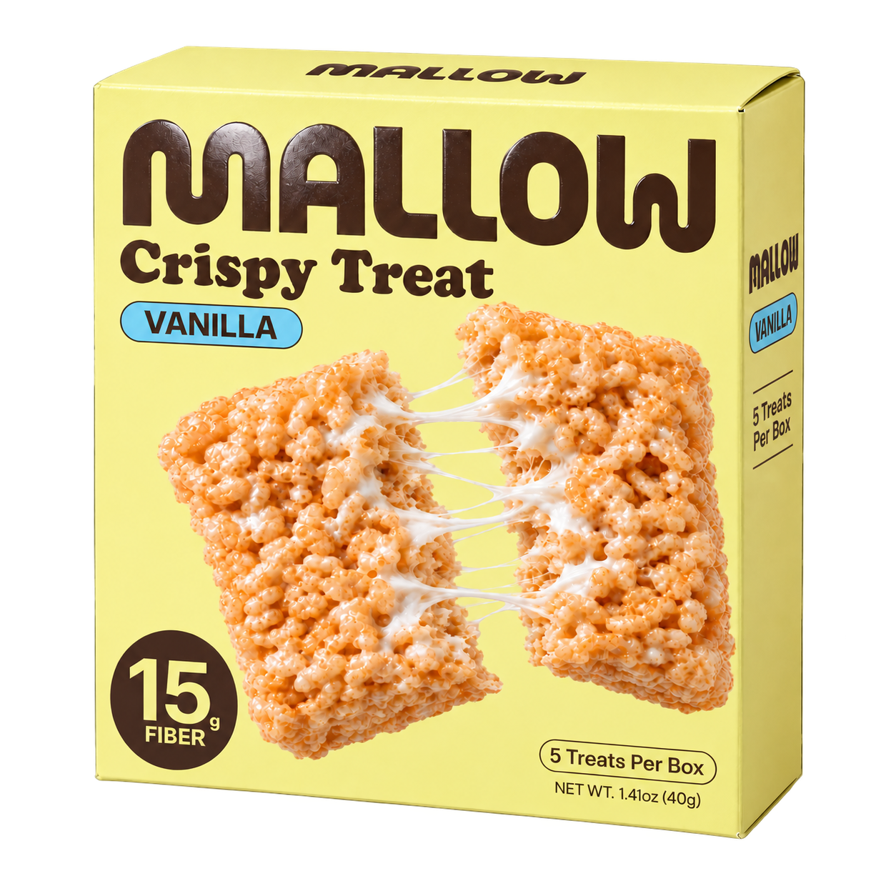
Make a high-fiber snack look as good as the treat it’s based on.
Naming, identity, cartons and individual wrappers for three flavors, packaging finishes, and a shelf mockup.
The idea
A crispy marshmallow treat is familiar. Added fiber gives it another reason to be picked up, but it still needs to look like something you want to eat.
The identity
The name comes from marshmallow, and the rounded lettering follows its lead. We made it big enough to be the first thing you notice on the pack.
Yellow keeps the pack bright. Brown lettering adds contrast and feels at home on a treat. Blue, brown, and purple labels help separate the flavors.
The packaging
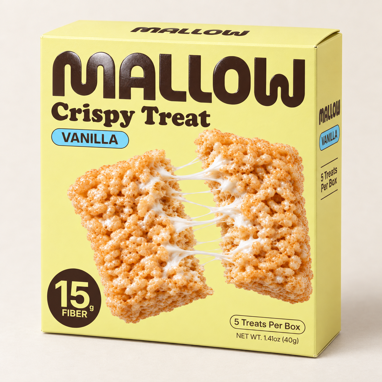
The name leads, followed by “Crispy Treat” and the flavor. The pulled-apart treat shows the marshmallow stretch, while the fiber callout stays easy to spot.
We kept that order on the carton and individual wrapper. We also chose soft-touch matte packaging with a raised glossy logo.
Scroll to see the artwork become a carton. The wrapper and finishThe range
Yellow and the brown logo stay the same. Blue marks Vanilla, brown marks Chocolate, and purple marks Birthday, with a different treat image for each.
The shelf
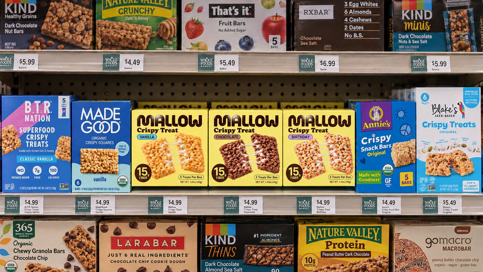
Together, the yellow cartons make a clear block on the shelf. The dark logo repeats across the range, and the colored labels help separate the flavors.
We use the mockup to ask: can you spot MALLOW and find your flavor from a few steps back?
Illustrative shelf mockup.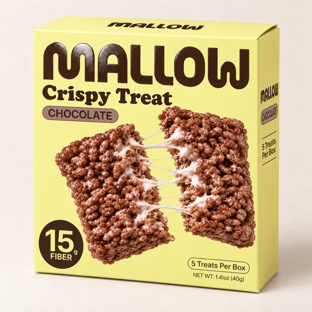
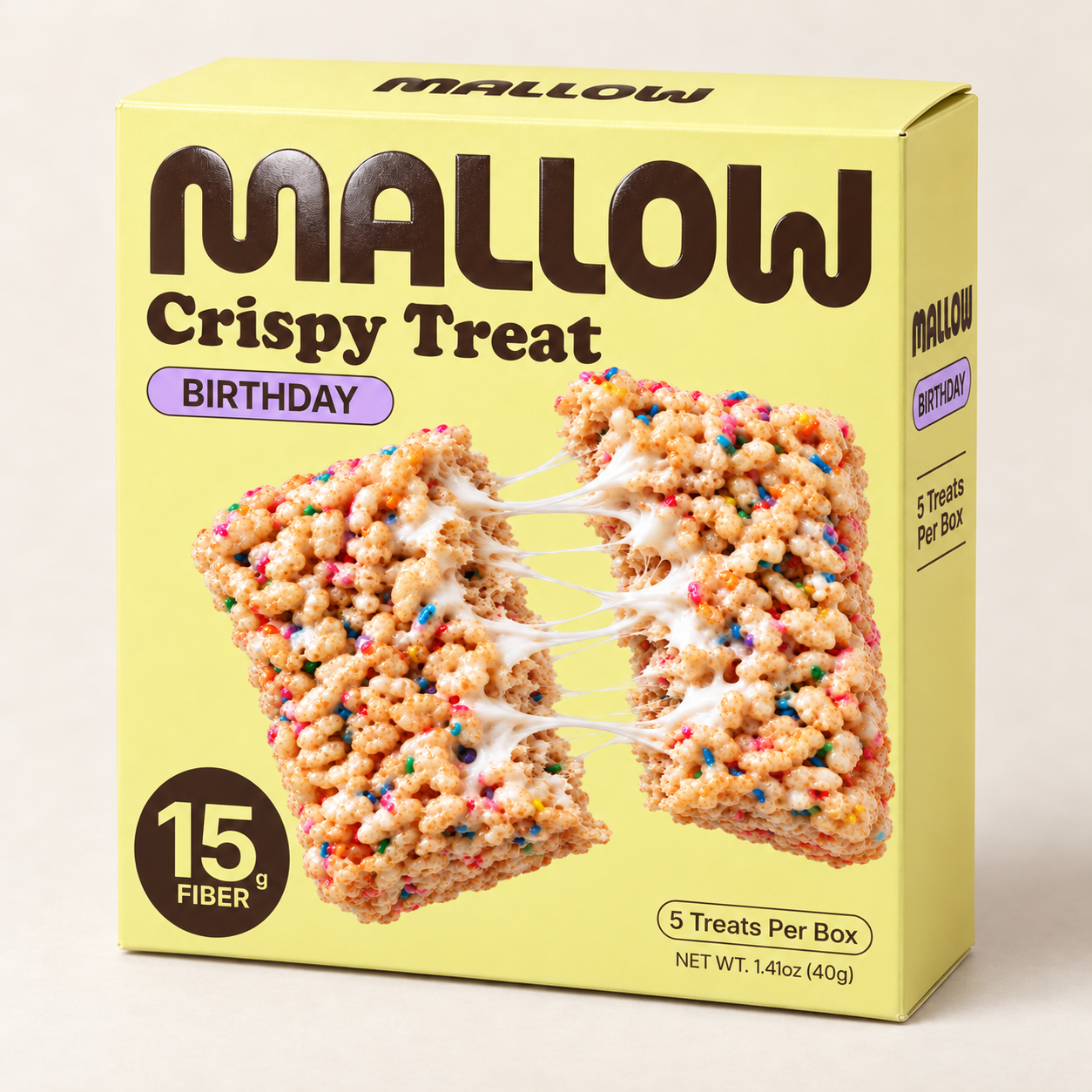
Yellow base, brown wordmark, carton shape, and front-panel layout.
The label color, flavor name, and product imagery.
MALLOW / The wrapper and the finish
We chose a smooth, soft-touch matte finish with a raised glossy logo. The wrapper should feel as carefully made as the treat inside.
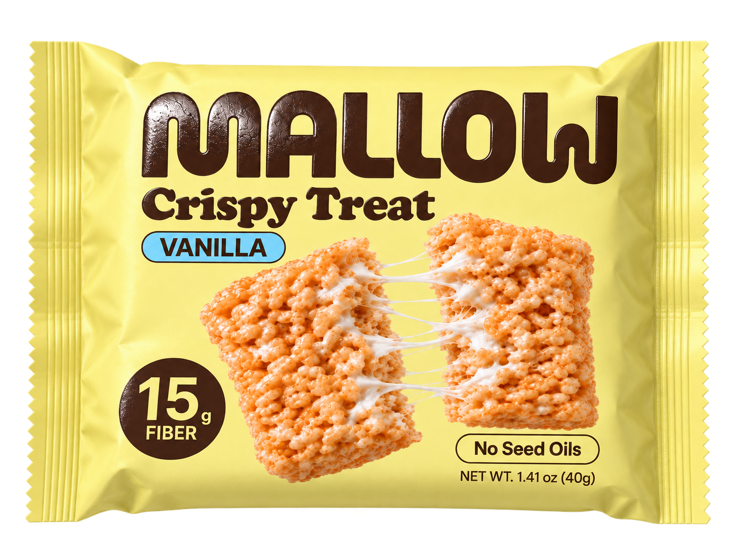
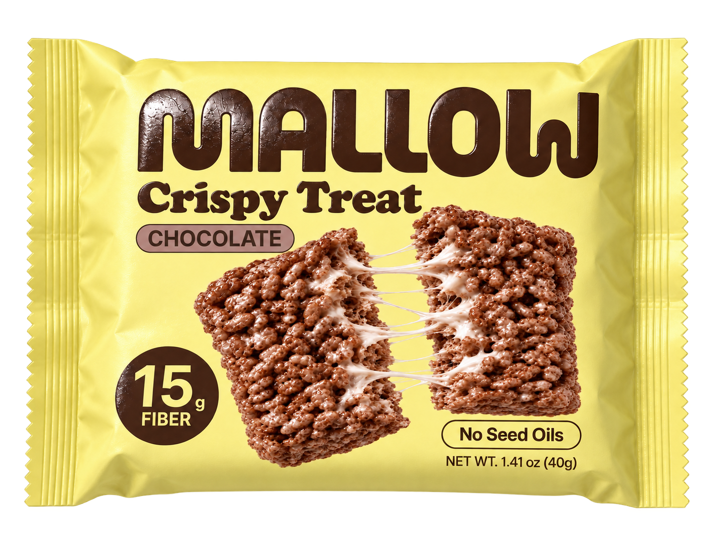
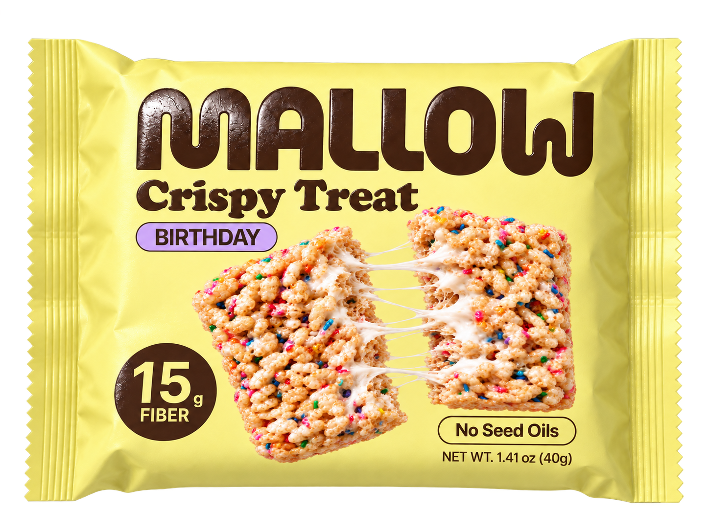
A smooth matte surface gives the wrapper a soft feel in the hand, echoing the marshmallow inside. It brings a little refinement to the bright yellow pack.
Raised gloss gives the brown logo a different texture. It catches the light, and you can feel the lettering against the matte wrapper.
We think about what happens after someone picks up the pack, too. How does it feel in their hand? Does it give them confidence in what’s inside?
The same yellow, logo, and flavor colors connect the carton to the individual wrapper.
Studio concept. Mockups show the proposed packaging finishes.
We help businesses stand out and give people a reason to choose them. Brand strategy, identity, and websites for products, services, and expertise.
Whatever you bring to the table, let’s make it worth coming back for.